Eater Charge Threshold
Charging and refunding eaters for item customizations they make when ordering.
Charge threshold allows restaurants to charge or refund eaters based on the customization choices they make.
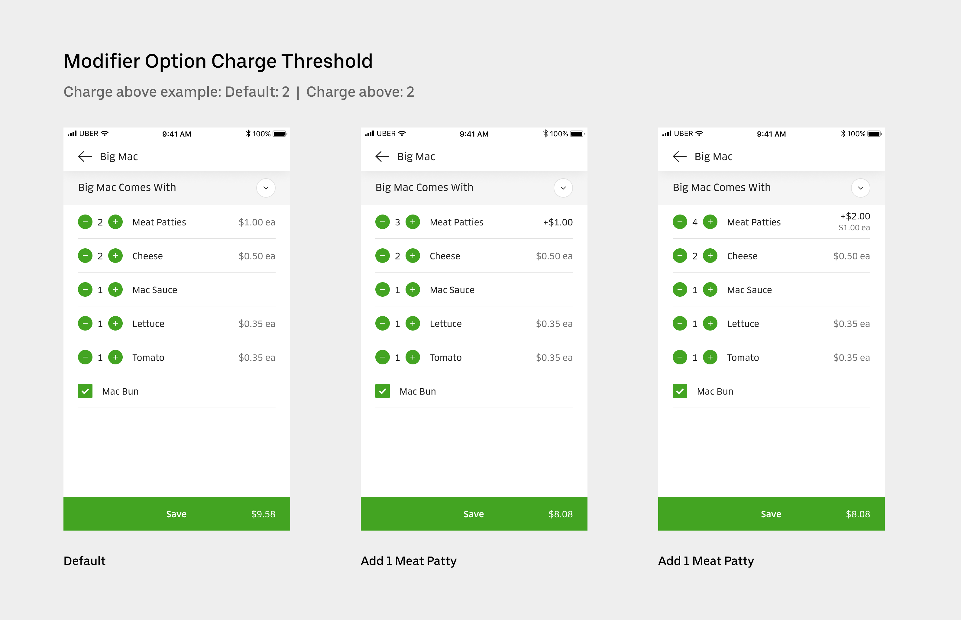
Previously, we have worked on charge thresholds on the modifier option (customization option) level. For example, the default recipe comes with 3 slices of tomatoes. You will be charged extra if you go over 5 slices and you will be refunded if you remove to under 2 slices.
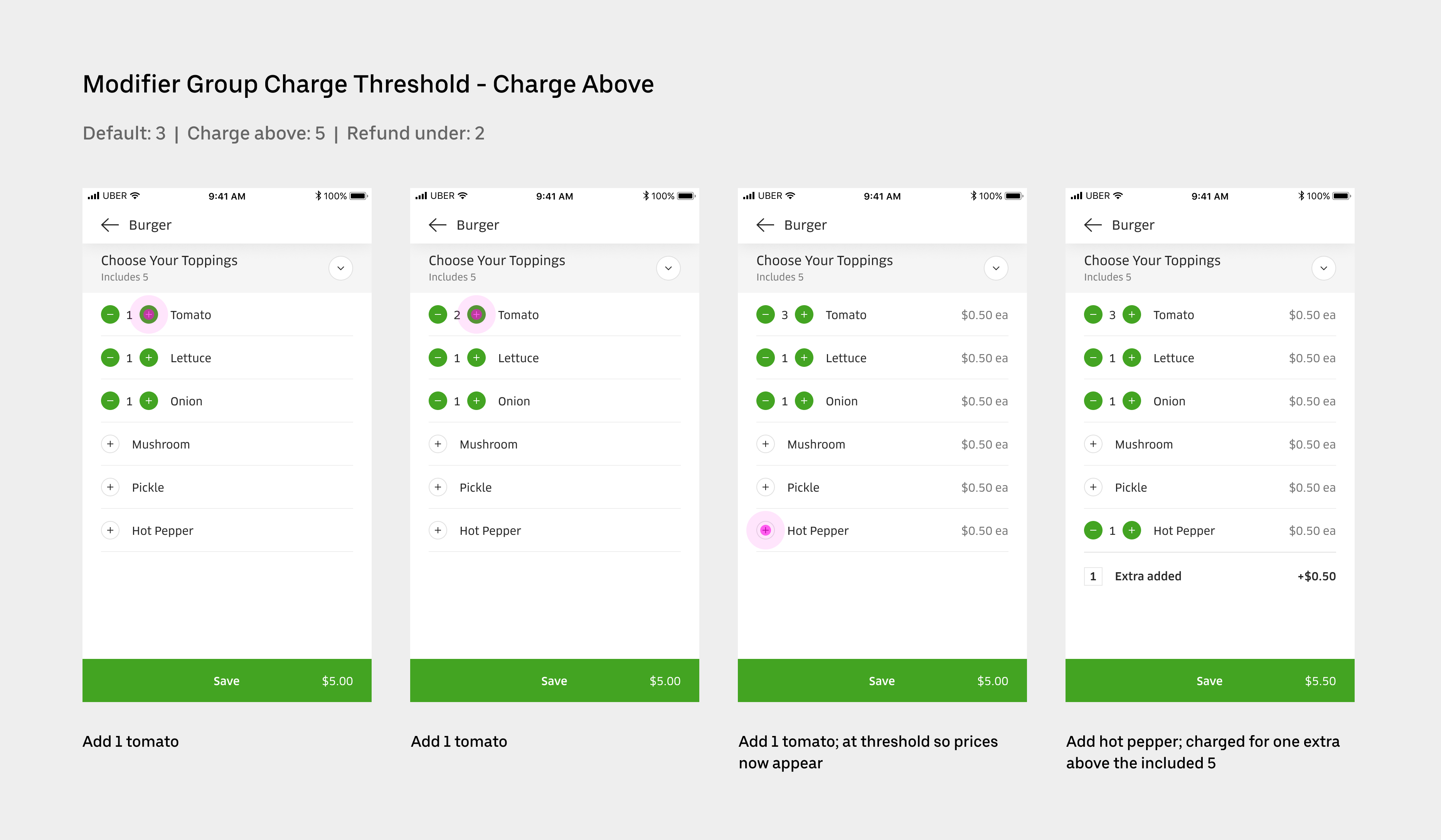
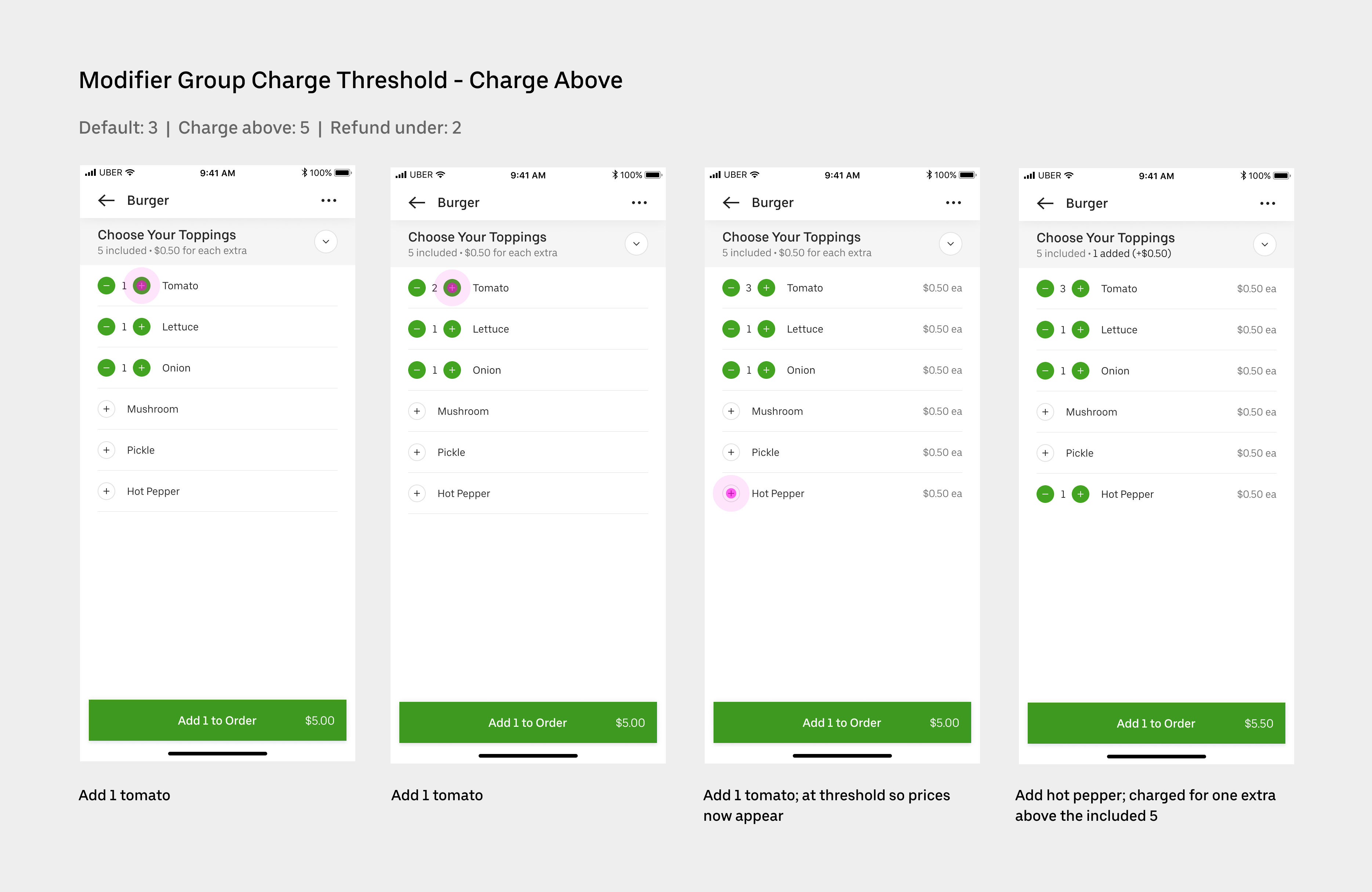
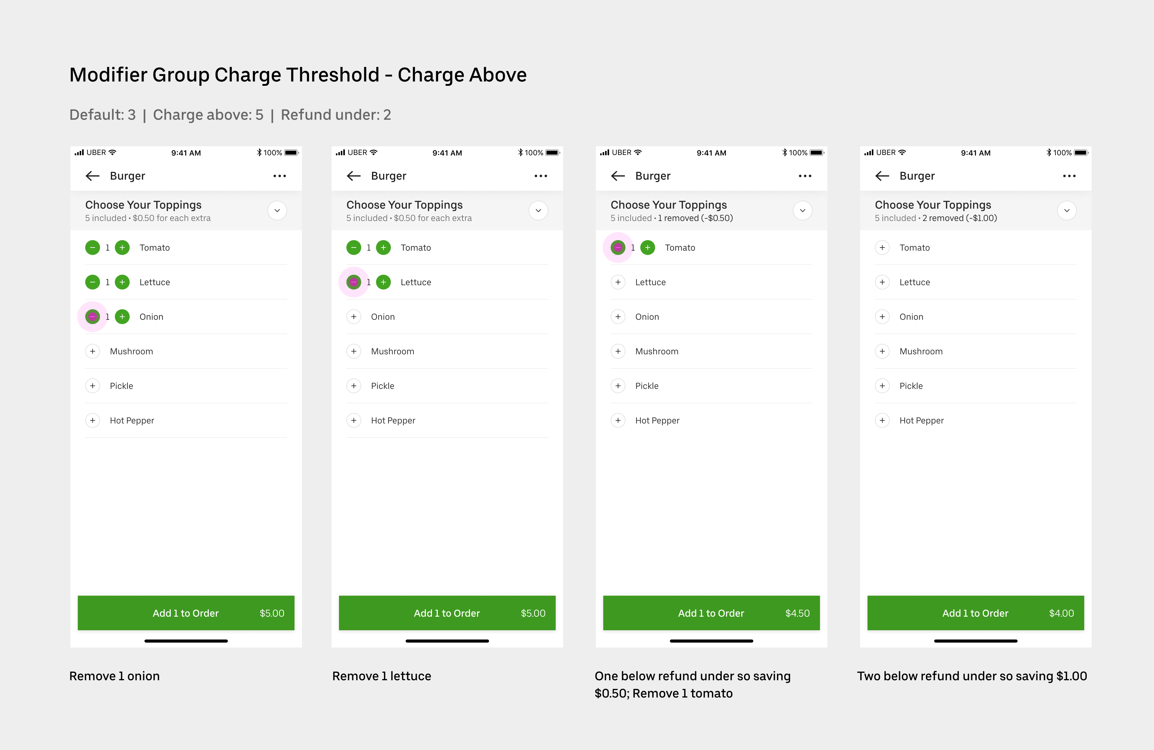
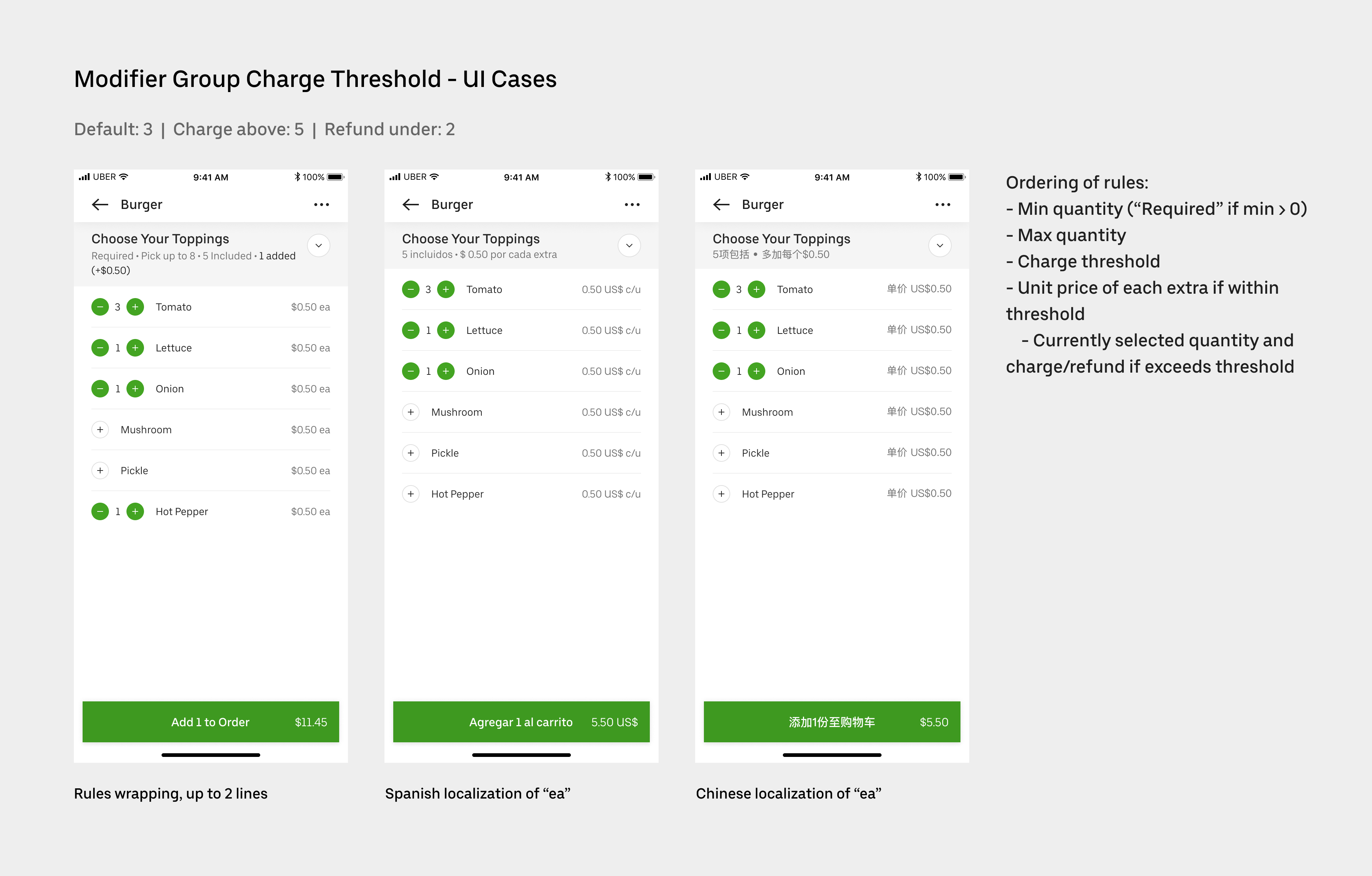
In order to support some of our enterprise restaurant partners, we need to further enable charge thresholds on the modifier group (customizations) level. For example, say that you have a “Choose Your Toppings” modifier group, you get charged extra only when you go over the “charge above” threshold. You get refunded when the number of items you select is under “refund under” threshold.
This is a particularly challenging project including designing intuitive consumer experience and touching a variety of surfaces for different user groups.
This project has shipped and is now live.
Context
I work on the Restaurant team at Uber Eats responsible of all projects related to menus. For this project, I led the design working closely with PM, Content Strategist, designers on the Eater team based in San Francisco and engineers.
Problem
Currently our menu structures do not support charge thresholds at a modifier group level, only at a modifier option level.
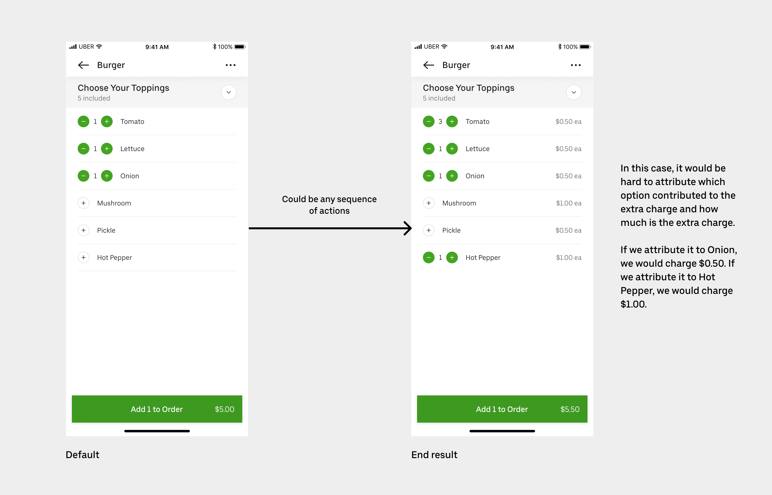
This was previously scoped as part of the Charge Thresholds project but was descoped due to attribution complexities. Specifically, when eater goes above the charge threshold, it’s difficult to attribute which option contributed to the extra charge (same goes for refund under). This becomes particularly troublesome when each option costs differently. Should we charge the most expensive one, or the least or the last one eater selected?
While negotiating with the enterprise client, we agreed to simplify the problem by restricting the feature to only modifier groups with modifier options of the same price. This would be sufficient for current needs and help bring their menus online faster.
We also won't attribute the extra charge back to the specific option. We will just show the total price difference on the modifier group level.
Why is it important?
Some of our strategic partners require this feature to have their menus on our platform.
It also adds to our library of complex menu structures that gives all restaurants wanting to use this feature a way to do so, especially for restaurants with complex customizations, such as salad bars, poke places etc.
Design
We prioritized the eater-facing experience to get the feature out as soon as we could. For this project, I took a mobile-first approach, as we have a web framework that translates mobile experience easily into web.
Menu Experience
The first instinct was to explore having a summary bar to display the extra charge or refund.
After design reviews with the Eater team, the feedback suggested that the summary bar might be confused as another item. It also feels disconnected from the rule “includes 5”, which is the cause of the extra charge. We need to push the visual and content further to explain what’s going on.
I iterated with Content Strategist on the visual and content, quickly realizing that it’s probably better to tie the rule and the charge/refund summary together. We stress-tested it with different rule combinations and localization. After a few more iterations on visual details, we made the decision on final treatment.
Checkout Experience
On the checkout page, eater needs to see a summary of the order, including the customizations, before confirming to pay.
For this feature to work, we need to modify the order summary to add the modifier group header and attribute on the group level.
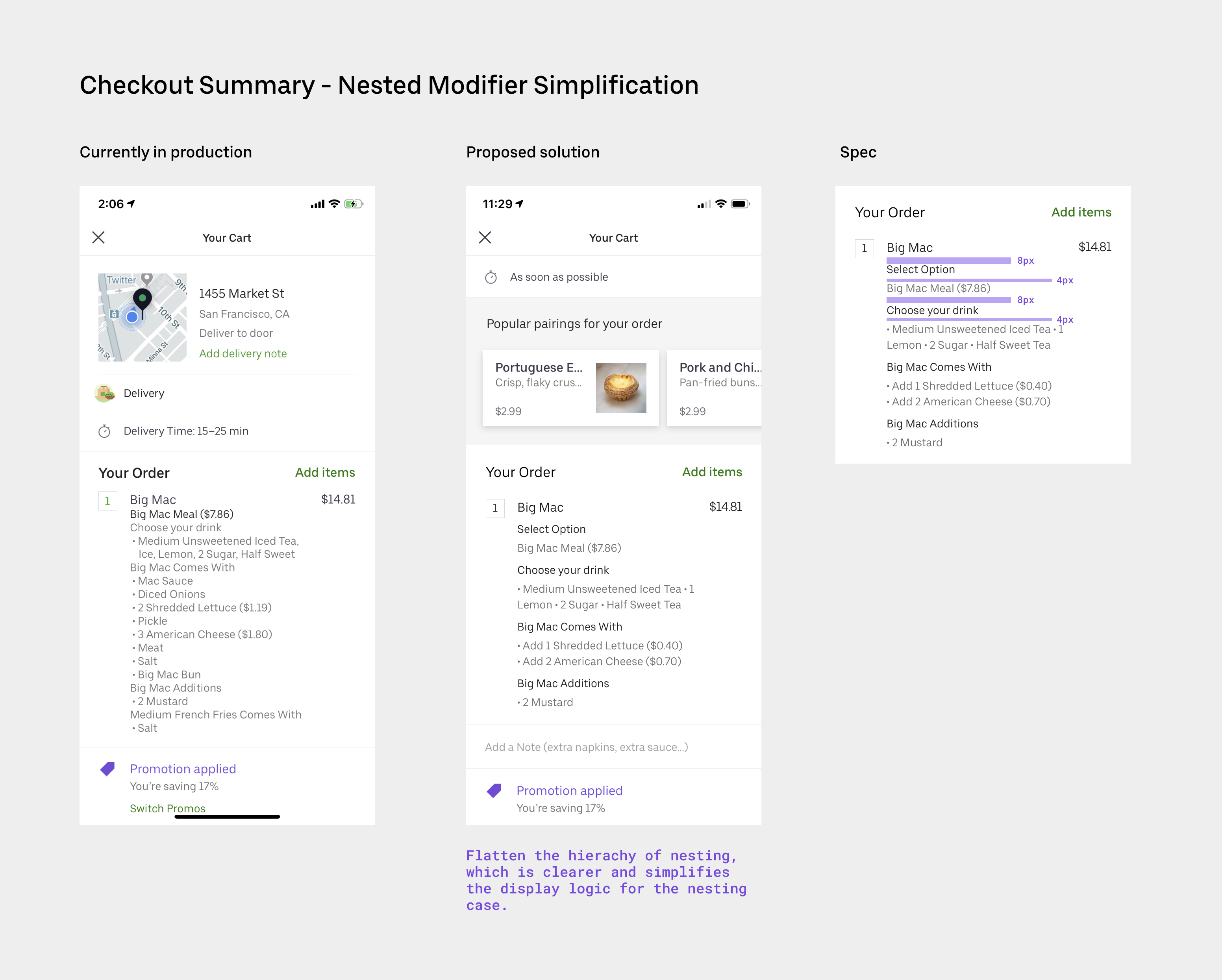
Meanwhile, I realized the current order summary can get convoluted and hard to scan, especially when you have a default recipe and you can make changes on top of it. I decided to clean it up with this project. We have two options to approach it:
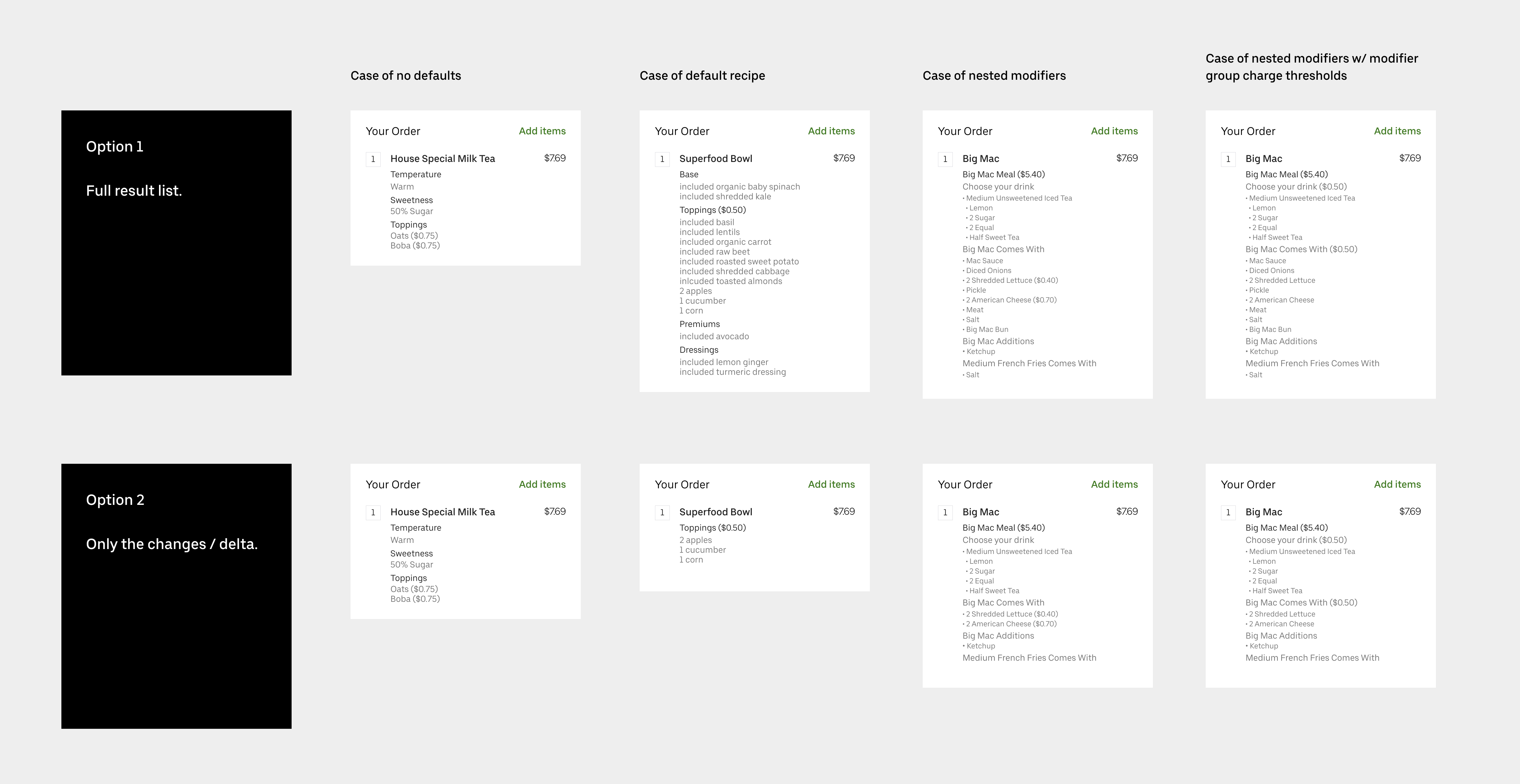
Option 1: Full result list. Pros: If you’re not familiar with the default recipe, it helps you review the result you’re going to get. It can answer the question: how many slices of apple in total I’m going to get. Cons: It can be long and not scannable.
Option 2: The delta only. Pros: It is clean and easy to scan. If you’ve ordered a few times, you don’t need to see the default recipe over and over again. Cons: It’s hard to answer the question: how many slices of apple in total I’m going to get.
After some competitor analysis, I realized that almost all competitors use Option 2. We also noticed that, it’s easy to go back to the menu to review all the selected options. It’s enough to just show the delta here.
Then I realized that the semantics are different between different selectors, such as radio buttons, checkboxes and incrementors. Each cases might need different treatment. I worked with Content Strategist to map out all the scenarios and tried to find a solution that is consistent, accurate and easy for localization.
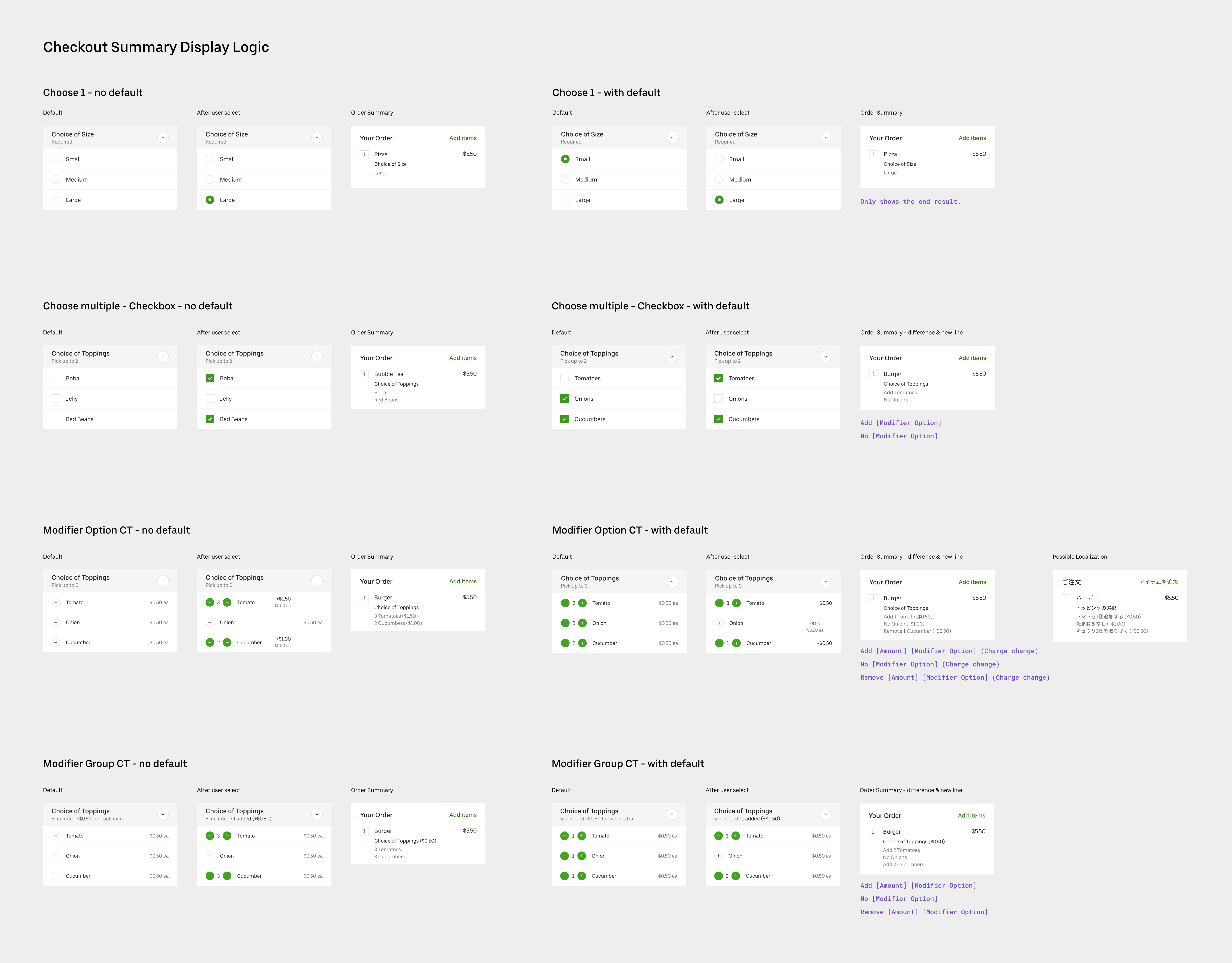
As engineers were building according to my spec, more questions emerged. For example, it would be hard to build a scalable UI for nested modifiers, which can be up to 6 levels deep. I proposed to flatten the nesting structure, as it doesn’t take away the clarity and it’s easier and more scalable to build.
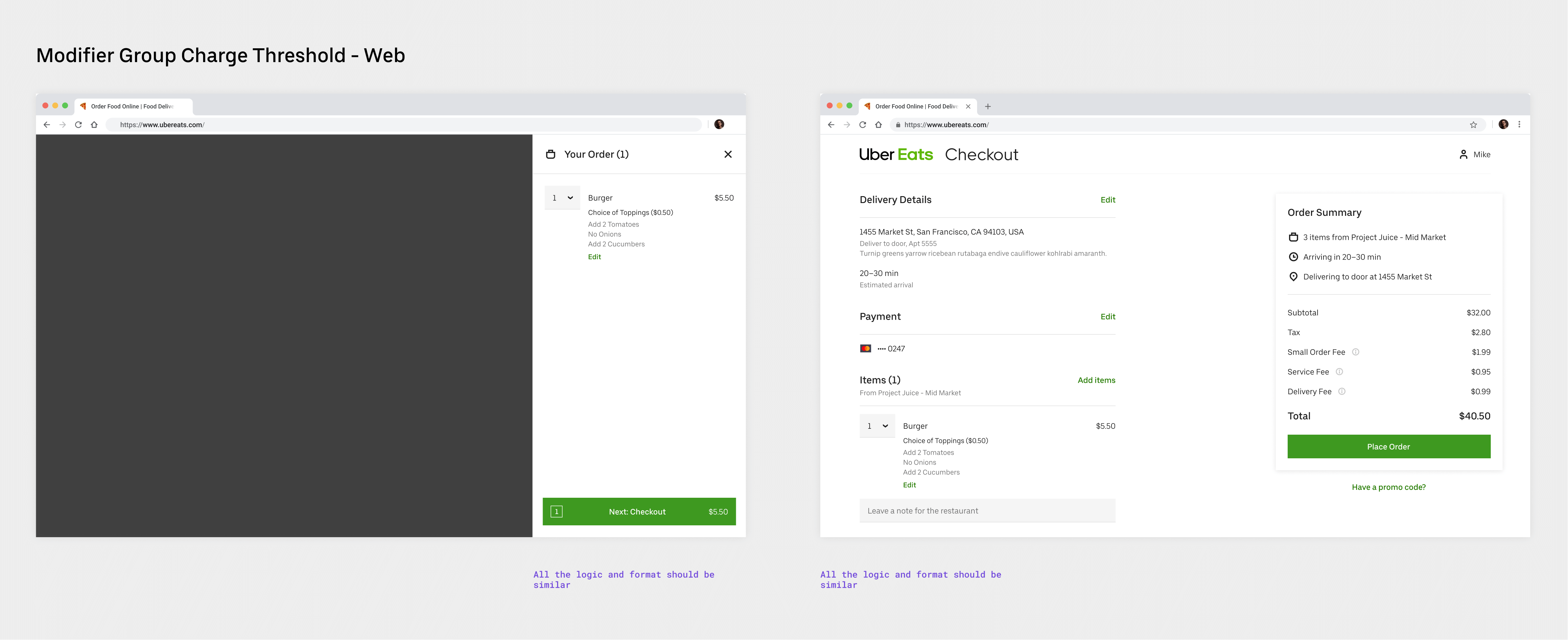
Web Experience
After the mobile experience was finalized, it was straightforward to translate it into web experience. I worked with the designer on web Eats to make sure the designs conformed with her framework.
Receipts & Other Restaurant Surfaces
The addition of the feature affects many other surfaces, such as receipts (mobile in-app and email), Restaurant Dashboard (the tablet app that the restaurant staff uses to process orders), Restaurant Manager (the web app where restaurant owners check eater reviews, order history, payouts etc.).
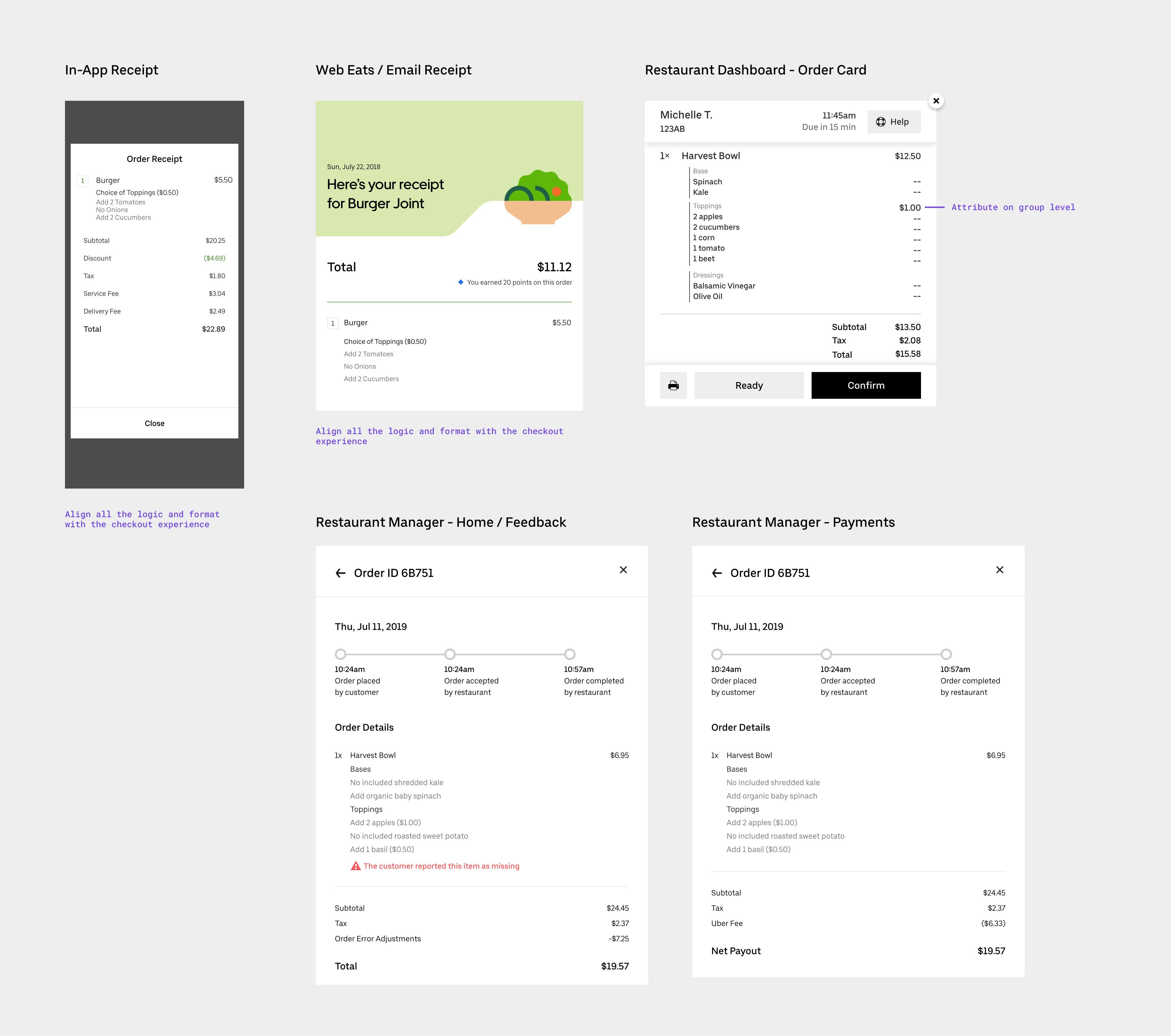
For each of the case, I examined the user needs and made changes accordingly. For example, for Restaurant Dashboard, it’s important for the chef to see the full ingredient list, instead of relying on his/her memory for the default recipe.
Learnings
- Menu projects are typically complex in nature. This project is especially challenging to embed complicated logic in a consumer experience.
- I improved my skills to coordinate cross-team collaboration by working with the Eater team in SF.
- I learned to tackle a project that systematically affects many surfaces.
- I improved my collaboration with engineers on making design decisions considering engineering constraints.